Brand Design
Welcome to my Brand Design portfolio page, Featured here are select works that showcase my brand building capability.
Each project is accompanied by a detailed account of my design process, from conception to execution. Explore the projects below to discover how thoughtful design can not only overcome challenges but also create impactful, memorable brand identities.
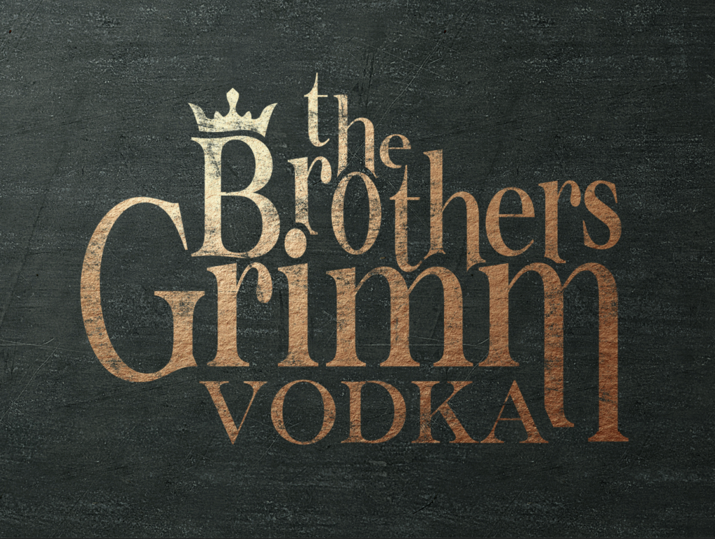
I was approached by my clients to design the logo and branding for the vodka company “The Brothers Grimm”. Designing a label for “The Brothers Grimm Vodka” was a captivating and imaginative process that aimed to capture the essence of mystery and enchantment associated with the famous literary duo.
My objective was to create a label that seamlessly blended folklore with a modern and sophisticated aesthetic, I employed a combination of traditional and digital design techniques to achieve this result.
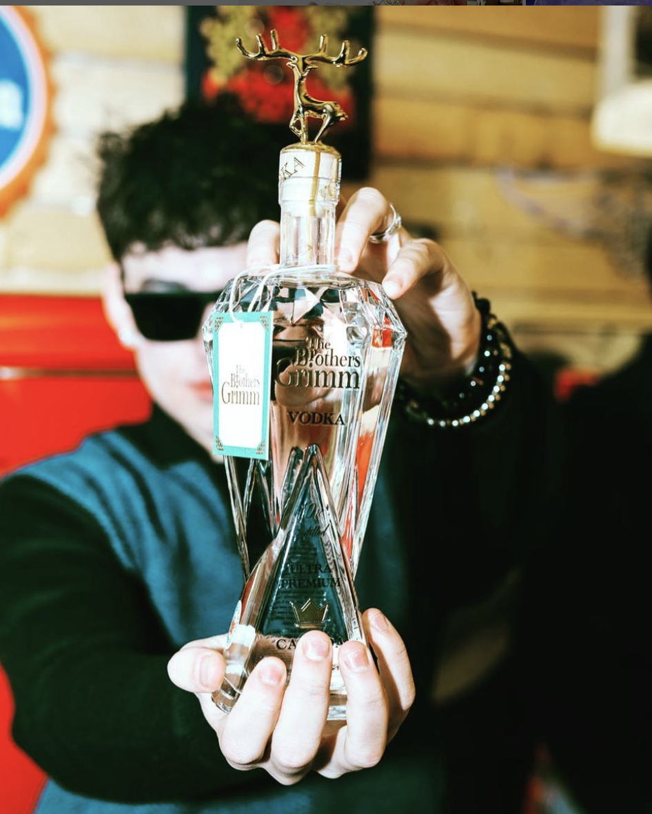
Creating the bottle design for The Brothers Grimm involved mutiple challenges:
- Differentiation: The primary challenge was ensuring the vodka bottle stood out in a crowded market.
- Design Concept: Deciding on a unique feature that would capture consumer attention while staying true to the brand.
- Aesthetic Balance: Maintaining a sophisticated design balance between the bottle and the gold figurine toppers to ensure appeal.
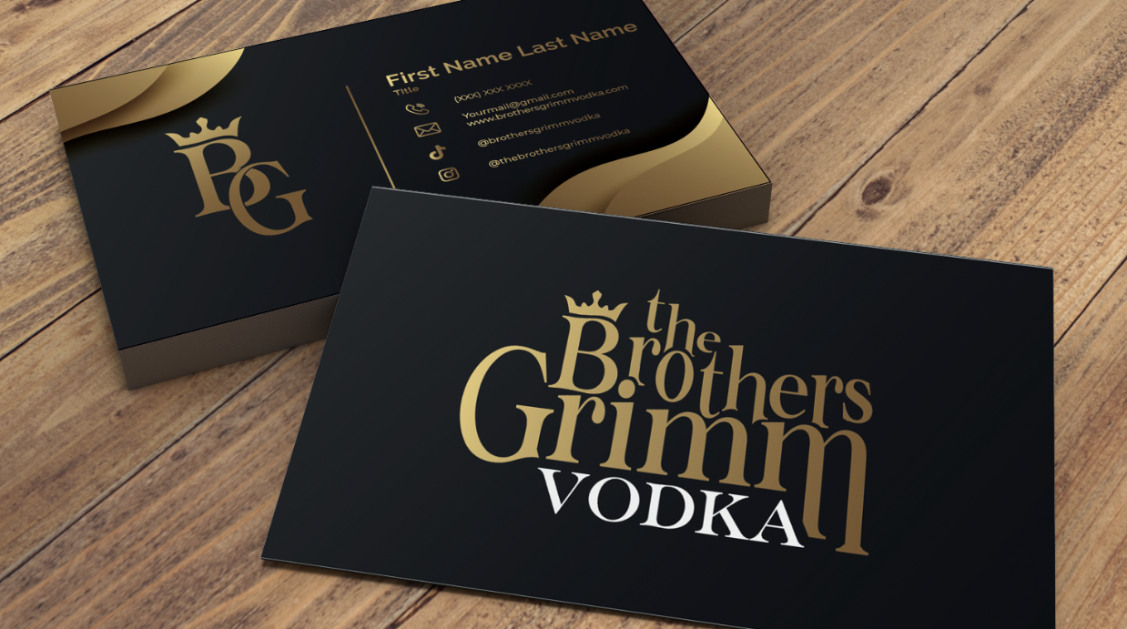
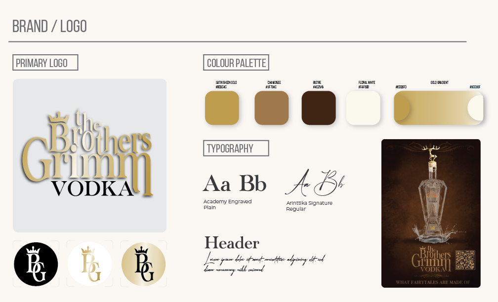
- Crown Motif: Symbolizes nobility, aligning with the mystical themes of Grimm fairy tales, adds a sense of fantasy.
- Gold Color Scheme: Elevates luxury, mirrors treasure from fairy tales, creates a visual connection to enchantment and wealth.
- Serif Fonts: Enhances elegance and tradition, contrasts with modern design elements for a balanced, timeless appeal.
Outcome: The combination of the crown, gold palette, and serif fonts merges fairy tale with modern luxury striking a balance between tradition and innovation. This bottle can be found at the LCBO.
The project assignment involved designing a logo for Liberate Rx, a pharmaceutical company with a unique mission of combining modern and holistic medicine. The task was to create a logo and branding guidelines that effectively emphasized this combination.
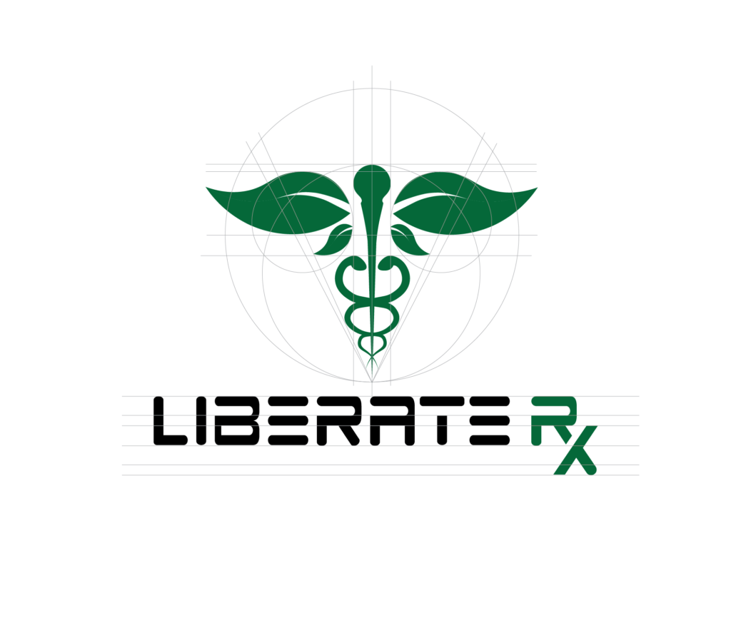
I decided the best approach was creatively integrating the traditional medical symbol, the Caduceus, with natural elements, specifically by replacing the traditional wings with leaves. This design aimed to visually represent the company’s innovative approach to healthcare, merging the credibility of modern medicine with the natural benefits of holistic practices.
Creating the logo for Liberate Rx presented several challenges:
Balancing Symbolism: Integrating the traditional Caduceus symbol with leaves to represent both modern and holistic medicine required careful consideration to ensure both elements were harmoniously balanced and easily recognizable.
Maintaining Clarity: Replacing the wings of the Caduceus with leaves posed the challenge of maintaining the symbol’s clarity and recognizability, ensuring it was still identifiable as a medical symbol while clearly conveying the holistic aspect.
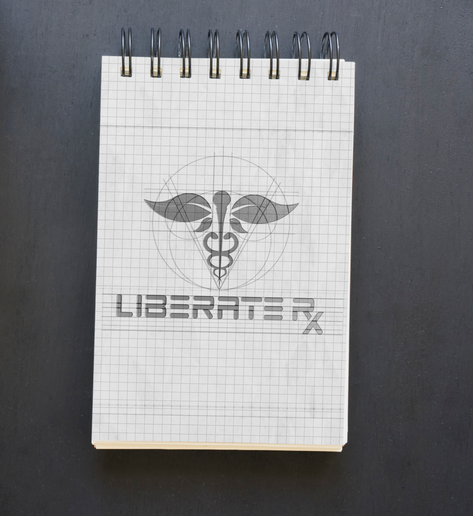
Addressing these challenges required iterative design processes, experimenting with various configurations, and testing the logo in different contexts to ensure it met the intended vision and functioned effectively across all applications.
- Inspiration & Modification: Traditional Caduceus symbol, representing medicine. Replacing wings with leaves to highlight natural, holistic healing.
- Symbolism: Leaves signify vitality and renewal, emphasizing Liberate Rx’s holistic approach.
- Color Palette: Green hues for natural aspects, complemented by blue for trustworthiness in modern medicine.
Outcome: A distinctive logo that merges traditional and holistic medicine, reflecting Liberate Rx’s innovative healthcare solutions.


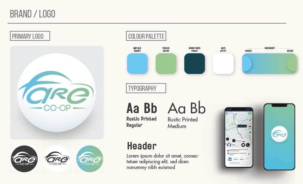
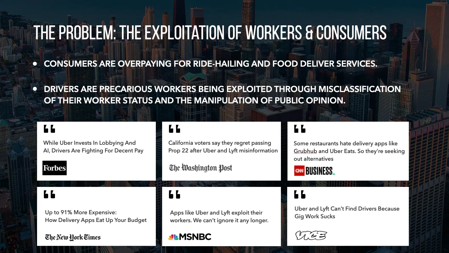
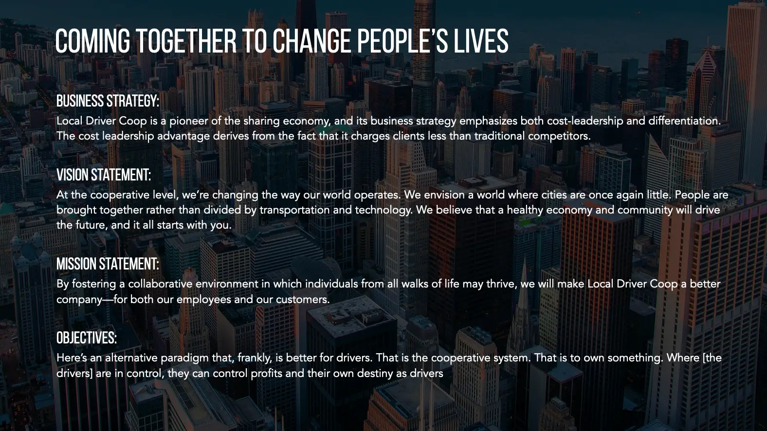
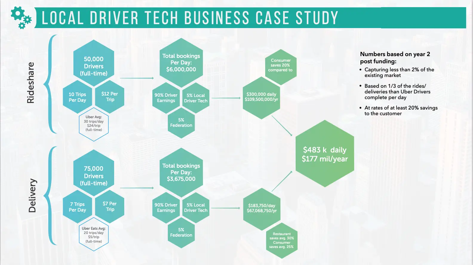
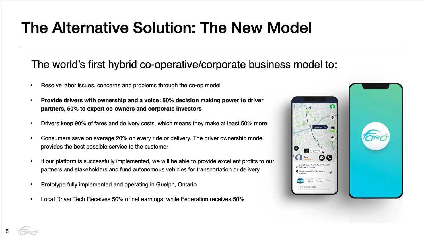
Collaborating with Fare provided an exceptional opportunity to contribute to a start-up’s foundational branding and digital presence. I was entrusted with the development of the company’s logo, branding guidelines, website, mobile application, and a presentation deck designed for venture capitalists. Fare distinguishes itself in the rideshare industry through a corporate/cooperative model, granting drivers equity within their respective districts. This innovative approach not only enhances earnings for drivers but also offers a cost-effective solution for riders.
This was a professionally enriching experience, underscored by the company’s commitment to redefining industry standards and fostering equitable growth.
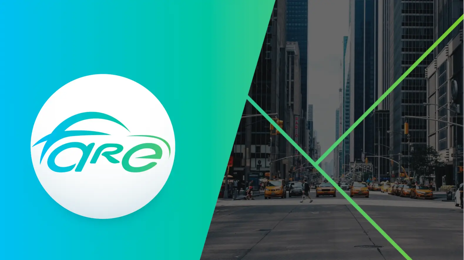
The challenge for this project was integrating the word fare into the logo as requested by the clients:
- Maintaining Readability: Ensuring that “fare” remained legible and easily recognizable within the confines of a car silhouette was a primary concern.
- Design Balance: Achieving a harmonious balance between the typography of “fare” and the car’s profile shape required meticulous adjustment of font size, style, and positioning.
- Innovation vs. Clarity: Striking the right balance between being innovative with the design while ensuring clarity and immediate recognition of the concept posed an ongoing challenge throughout the design process.
- Typography Integration: Chose a sleek, modern font for “fare” that seamlessly melds into the car’s profile, ensuring readability and brand alignment.
- Car Silhouette: Opted for a minimalist car outline that provided enough structure for the word “fare” to be clearly integrated, maintaining simplicity and recognizability.
Outcome: The final design is a distinctive, cohesive logo that encapsulates Fare’s innovative rideshare model, ensuring brand identity is effectively communicated while maintaining functional versatility across various media.